Reading: Lesson 3 - Income Inequality
1. Income Inequality
- Income inequality in the United States has soared in the last half century. According to the Congressional Budget Office, between 1979 and 2007, real average household income—taking into account government transfers and federal taxes—rose 62%. For the top 1% of the population, it grew 275%. For others in the top 20% of the population, it grew 65%. For the 60% of the population in the middle, it grew a bit under 40% and for the 20% of the population at the lowest end of the income distribution, it grew about 18%.Congressional Budget Office, “Trends in the Distribution of Household Income Between 1979 and 2007,” October 2011, http://www.cbo.gov/ftpdocs/124xx/doc12485/10-25-HouseholdIncome.pdf.
- Increasingly, education is the key to a better material life. The gap between the average annual incomes of high school graduates and those with a bachelor’s degree increased substantially over the last half century. A recent study undertaken at the Georgetown University Center on Education and the Workforce concluded that people with a bachelor’s degree earn 84% more over a lifetime than do people who are high school graduates only. That college premium is up from 75% in 1999.Anthony P. Carnevale, Stephen J. Rose, and Ban Cheah, The College Payoff: Education, Occupation, and Lifetime Earnings, Georgetown University Center on Education and the Workforce: 2011, http://cew.georgetown.edu/collegepayoff. Moreover, education is not an equal opportunity employer. A student from a family in the upper end of the income distribution is much more likely to get a college degree than a student whose family is in the lower end of the income distribution.
That inequality perpetuates itself. College graduates marry other college graduates and earn higher incomes. Those who do not go to college earn lower incomes. Some may have children out of wedlock—an almost sure route to poverty. That does not, of course, mean that young people who go to college are assured high incomes while those who do not are certain to experience poverty, but the odds certainly push in that direction.
We shall learn in this section how the degree of inequality can be measured. We shall examine the sources of rising inequality and consider what policy measures, if any, are suggested. In this section on inequality we are essentially focusing the way the economic pie is shared, while setting aside the important fact that the size of the economic pie has certainly grown over time.
2. Explaining Inequality
- Everyone agrees that the distribution of income in the United States generally became more equal during the first two decades after World War II and that it has become more unequal since 1968. While some people conclude that this increase in inequality suggests the latter period was unfair, others want to know why the distribution changed. We shall examine some of the explanations.
- Clearly, an important source of rising inequality since 1968 has been the sharp increase in the number of families headed by women. In 2010, the median income of families headed by married couples was 2.5 times that of families headed by women without a spouse. The percentage of families headed by women with no spouse present has nearly doubled since 1968 and is thus contributing to increased inequality across households.
Technological change has affected the demand for labor. One of the most dramatic changes since the late 1970s has been an increase in the demand for skilled labor and a reduction in the demand for unskilled labor.
The result has been an increase in the gap between the wages of skilled and unskilled workers. That has produced a widening gap between college- and high-school-trained workers.
Technological change has meant the integration of computers into virtually every aspect of production. And that has increased the demand for workers with the knowledge to put new methods to work—and to adapt to the even more dramatic changes in production likely to come. At the same time, the demand for workers who do not have that knowledge has fallen.
Along with new technologies that require greater technical expertise, firms are adopting new management styles that require stronger communication skills. The use of production teams, for example, shifts decision-making authority to small groups of assembly-line workers. That means those workers need more than the manual dexterity that was required of them in the past. They need strong communication skills. They must write effectively, speak effectively, and interact effectively with other workers. Workers who cannot do so simply are not in demand to the degree they once were.
The “intellectual wage gap” seems likely to widen as we move even further into the twenty-first century. That is likely to lead to an even higher degree of inequality and to pose a challenge to public policy for decades to come. Increasing education and training could lead to reductions in inequality. Indeed, individuals seem to have already begun to respond to this changing market situation, since the percentage who graduate from high school and college is rising.
3. Tax Policy
Did tax policy contribute to rising inequality over the past four decades? The tax changes most often cited in the fairness debate are the Reagan tax cuts introduced in 1981 and the Bush tax cuts introduced in 2001, 2002, and 2003.
An analysis of the Bush tax cuts by the Tax Foundation combines the three Bush tax cuts and assumes they occurred in 2003. The Table below "Income Tax Liability Before and After the Bush Tax Cuts" gives the share of total income tax liability for each quintile before and after the Bush tax cuts. It also gives the share of the Bush tax cuts received by each quintile.
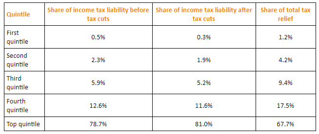
Note: The share of total tax relief received by the first four quintiles was modest, while those in the top quintile received more than two-thirds of the total benefits of the three tax cuts. However, the share of income taxes paid by each of the first four quintiles fell as a result of the tax cuts, while the share paid by the top quintile rose.
Tax cuts under George W. Bush were widely criticized as being tilted unfairly toward the rich. And certainly, the Table above "Income Tax Liability Before and After the Bush Tax Cuts" shows that the share of total tax relief received by the first four quintiles was modest, while those in the top quintile garnered more than two-thirds of the total benefits of the three tax cuts. Looking at the second and third columns of the table, however, gives a different perspective. The share of income taxes paid by each of the first four quintiles fell as a result of the tax cuts, while the share paid by the top quintile rose. Further, we see that each of the first four quintiles paid a very small share of income taxes before and after the tax cuts, while those in the top quintile ended up shouldering more than 80% of the total income tax burden. We saw in the Figure below "The Distribution of U.S. Income, 1968 and 2010" that those in the top quintile received just over half of total income. After the Bush tax cuts, they paid 81% of income taxes. Others are quick to point out that those same tax cuts were accompanied by reductions in expenditures for some social service programs designed to help lower income families. Still others point out that the tax cuts contributed to an increase in the federal deficit and, therefore, are likely to have distributional effects over many years and across several generations. Whether these changes increased or decreased fairness in the society is ultimately a normative question.
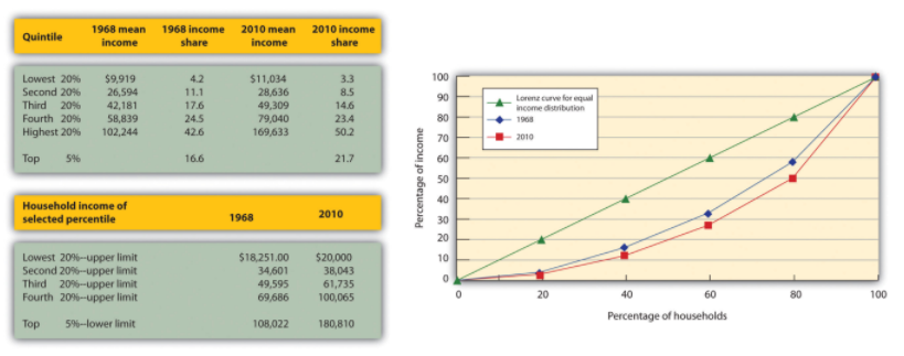
Note: The distribution of income among households in the United States became more unequal from 1968 to 2010. The shares of income received by each of the first four quintiles fell, while the share received by the top 20% rose sharply. The Lorenz curve for 2010 was more bowed out than was the curve for 1968. (Mean income adjusted for inflation and reported in 2010 dollars; percentages do not sum to 100% due to rounding.)
4. Methodology
- The method by which the Census Bureau computes income shares has been challenged by some observers. For example, quintiles of households do not contain the same number of people. Rea Hederman of the Heritage Foundation, a conservative think tank, notes that the top 20% of households contains about 25% of the population. Starting in 2006, the Census Bureau report began calculating a measure called “equivalence-adjusted income” to take into account family size. The Gini coefficient for 2010 using this adjustment fell slightly from 0.469 to 0.457. The trend over time in the two Gini coefficients is similar. Two other flaws pointed out by Mr. Hederman are that taxes and benefits from noncash programs that help the poor are not included. While some Census studies attempt to take these into account and report lower inequality, other studies do not receive as much attention as the main Census annual report.Rea S. Hederman, Jr., “Census Report Adds New Twist to Income Inequality Data,” Heritage Foundation, Policy Research and Analysis, No. 1592, August 29, 2007.
Even studies that look at incomes over a decade may not capture lifetime income. For example, people in retirement may have a low income but their consumption may be bolstered by drawing on their savings. Younger people may be borrowing to go to school, buy a house, or for other things. The annual income approach of the Census data does not capture this and even the ten-year look in the mobility study mentioned above is too short a period.
This suggests that more precise measurements may provide more insight into explaining inequality.
Last modified: Tuesday, August 14, 2018, 10:16 AM