Reading: Lesson 7 - Using Data in Decision Making
7.7.A - Using Data in Decision Making
1. COMMUNICATING RESULTS OF DATA
- Managers need information for decision making. However, if the information is misinterpreted or misunderstood, poor decisions will result. The time devoted to data collection and analysis will be wasted unless important results are identified, clearly communicated, and used as the basis for answering questions, solving problems, and developing plans. The data analysis procedures are completed by identifying important results and then communicating those results in an understandable way.
- Having a large amount of data to review can present problems for decision makers. What information is important and what is irrelevant? Are we being objective in reviewing information or are we allowing personal values and biases to influence us? Is our approach to reviewing the information causing us to overlook or misinterpret important information? The following guidelines will help in completing an effective analysis of the data that have been collected.
• Focus on the problem or question. Why was the data collected? What decision needs to be made? Given a large amount of information, it is easy to lose sight of the reasons the data were collected. Avoid becoming distracted by interesting information that does not directly relate to the decision to be made.
• Recognize the purpose of the data analysis. Is the analysis being done to describe, understand, and examine characteristics or is it to make comparisons, examine relationships, or make predictions for the future? Reviewing the purpose will keep the appropriate focus on the correct statistics and data summaries as well as appropriate uses of the data.
• Summarize the information accurately. Going through pages and pages of data or looking at many screens of information on a computer makes it easy to ignore or overlook important information. Prepare effective summaries of the information using appropriate statistical tools. Calculate frequencies, distributions, and averages for all important categories of information. Check the calculations to make sure all necessary information has been included and the calculations are accurate.
• Look for changes, differences, and unexpected results. What information is different from past experience or from what was expected? Are the results from one or more groups quite different from others? Where have the greatest and smallest changes occurred? Are there some characteristics that seem to be different from most others?
• Search for patterns or relationships. Are there characteristics or conditions that seem to be related to particular results? Do changes seem to occur under certain conditions but not others? When patterns and relationships are identified, it is not always a cause-and-effect situation. Cause-and-effect is the relationship between two events in which the second event is a direct consequence of the first. In a cause-and-effect situation, an action or change occurs as a result of something that preceded it. The action or change is the effect and the preceding action or event is the cause. Rain causes grass to grow. Eating too much leads to weight gain. However, in most data analysis, it is difficult to determine with confidence that a change or an action was the result of something else. Typically, decision makers identify relationships, meaning two events or actions seem to be related to each other, without judging whether one of the events occurred as a direct result of the other. Only carefully designed and controlled experiments can provide the type of evidence needed to precisely determine cause-and-effect. - The reason for information gathering and data analysis is to aid in problem solving and decision making. Almost all employees and managers have more information available to them than they have the time to review and understand. Yet they need information to make good decisions. Information needs to be analyzed, summarized, and communicated to decision makers. Information summaries can also be used to explain how and why decisions were made and to help others understand and support the decisions as they are implemented. In the business environment, information is summarized and communicated in two main ways: in text or through visuals such as tables, charts, and graphs.
- A complete written report includes a statement of the problem or purpose, a description of the data collection procedure, all important data collected, and the identification and analysis of possible decisions. If a final decision has been made, it will be included in the report along with plans for implementing the decision. People who want to study the information in detail will want to see the full report. However, some people prefer to see the executive summary. An executive summary is a concise written summary of a longer report containing adequate information for the reader to fully understand the information being communicated. It is typically only a few pages long.
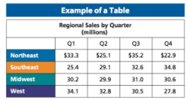
- The preferred way of summarizing and communicating numerical information is with tables, charts, and graphs. Many people can more easily study and understand vast quantities of information when summarized and presented visually. Well-designed tables, charts, and graphs are more attention getting and memorable than written summaries of the data. In addition to presenting and summarizing data, these visuals can be used to illustrate relationships. Tables, charts, and graphs have unique characteristics and specific purposes when used to summarize and present data. A table is a visual presentation of information organized in rows and columns. When the information represented in a table is numerical, it is often called a data table. Tables are used to summarize data and clearly communicate complicated information to readers. Because information is organized in rows and columns, a table can contain more information than a chart or graph. However, tables need to be well designed and carefully prepared to communicate information clearly and objectively.
- The main components of a table are the title, column headings, row headings, and cell data. The title identifies the focus or purpose of the table. It should be concise, specific, and clear. In the Figure below, the title indicates that the table is presenting information about the company’s regional sales for each quarter of the year. The column and row headings identify the characteristics or variables from the data set included in the table. In the example table, each of the company’s regions appears as a row heading and the four quarters of the year appear as column headings. Finally, the cell data are presented for each region and quarter. In the table, the data appear as two digit numbers with one decimal place, but the table title indicates the data represent millions of dollars. The table provides an effective summary of the company’s sales by region and by quarter.
- A chart is a type of diagram that organizes and summarizes a set of numerical data. A chart is usually simpler than a table and focuses on summarizing and comparing information for one or two characteristics in a data set. The most common types of charts are the bar chart and pie chart. A bar chart presents important characteristics from the data set as bars whose lengths are proportional to their values. A bar chart allows easy comparison of values among Example of a Chart $40 $30 $20 $10 $0 Quarterly Sales by Region (millions) Q1 Q2 Q3 Q4 Northeast Southeast Midwest West characteristics, or among one characteristic over a period of time. over periods of time. A pie chart represents one or more important characteristics from a data set as a circle divided into sections. Each segment represents a specific part of the characteristic being analyzed. The size of each section represents its proportion of the total value of the characteristic. An example of a chart appears in the Figure below.
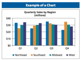
The main components of a chart are the title, data presentation, data labels, and the legend. As with a table, the chart title identifies the focus or purpose of the table. The data presentation is the content within the chart. Data in a bar chart show the values of each characteristic as a bar where the length of the bar represents the proportional value. The bars are aligned to provide the clearest comparison of the values related to the problem or issue being studied. In a pie chart, the data are shown as segments of the circle or pie. Comparisons are made based on the relative size of each segment. All characteristics of the data should be summarized and organized into understandable and meaningful categories. The categories should be clearly identified with data labels. Frequently a chart legend is included to identify each of the variables in the chart. Legends are usually color coded or shaded to provide a unique identification for each variable. When presenting data in charts, one recommendation is to avoid the use of green and red due to color-blindness of many reviewers. Review the chart in the Figure above. The title states that the company sales are being compared by region and by quarter. The data are grouped by quarter for easier comparison of regional sales in each quarter of the year. Quarters are clearly labeled below each grouping of data. To make it easy to identify the region, a color-coded legend is included in the chart.
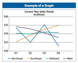
A graph (also called a line graph) is a visual representation of data as they change over time. An example appears in the Figure below. Data are shown as one or more lines connecting data points. Each data point identifies the value of the characteristic at a particular time. A line graph may present information on one or multiple characteristics or categories of the data being studied. The main components of a graph are the same as for charts—title, data presentation, data labels, and legend. The data are presented in graph form with a horizontal axis and a vertical axis. A graph is an excellent way to study trends. A trend is a general direction in which something is developing or changing. The graph in the Figure below compares sales in each region over the entire year. The data presentation makes it easy to observe trends in sales for each region and to compare the full year’s sales performance of all regions.
2. MAKING DATA BASED DECISIONS
- Managers have access to large amounts of data and other information that can be helpful in making decisions. To be successful, managers must become efficient in reading and understanding information, selecting the information that will be most helpful, and then incorporating their findings into the decision-making process.
- In preparing to make a decision, managers should take the time to review written summaries of information. Most written summaries will include data in the forms of tables, charts, and graphs as well as discussions of procedures and results. For each summary, it is important to determine the source of the data used to prepare the summary and have access to the complete information if needed. Individuals preparing reports should ensure that the process used to collect, analyze, and summarize information is clear, objective, and unbiased. In most businesses, people who are skilled in data collection and data analysis are responsible for those procedures and have the expertise and experience needed to prepare reports. If necessary, managers can contact the people responsible for data analysis and ask them to explain summaries or the procedures used to gather, analyze, and present the information.
- The next step is to study carefully each table, chart, and graph that summarizes the key data needed to make a decision. Because tables, charts, and graphs are summaries, it may be necessary to obtain additional information for complete understanding. However, effective summaries should provide most if not all of the information needed for day-to-day decision making. The following procedures should be followed when studying tables, charts, and graphs:
1. Read the title carefully. The title communicates the specific purpose of the summary. It will identify the type of information that is contained in the graphic and how the data are being presented. Is it a description of information, a comparison of two or more types of information, or a more complex analysis or projection?
2. Determine what is represented in the data set. Is it all available data or just a part? If sample data are presented, is the information a representative sample or does it reflect a unique portion of the full data?
3. Review the row and column headings of a table or the data labels and legends on charts and graphs. What are the characteristics that are examined in the graphic? Is the focus on one characteristic with an analysis of its components (employees by age, gender, years, or experience) or are two or more characteristics being analyzed (sales volume and advertising expenditures)? Determine how information about the characteristics relates to the problem or question being studied. The headings and labels should show the range of possible data being presented. A chart or graph can look very different if a small range of numbers is used for each category compared to one with a very large range.
4. Examine the type of data being reported in the data cells or data presentation. The data might be in the form of numbers, percentages, frequency counts, or averages. Each type of data will present a different view of the issue being studied. Be aware of the units being used to report data. Zeroes may have been omitted and replaced with decimals to reflect data in thousands or millions. The units being represented should be noted in the title or data labels.
5. Finally, study all of the data carefully and thoroughly to understand their meaning. What information stands out? What characteristics seem to be different from others? How do the results compare to what was expected? What are the ranges of data? Are most categories near the top or bottom of the range or are they distributed across the range? Is there evidence of relationships among variables that seems to indicate better or worse performance? Return to the problem or question and analyze how the data offer information relating to possible solutions or answers. - Although data are used in decision making, data alone cannot answer a question or solve a problem. Information is incorporated into decision making to make the decision more objective. It helps managers determine possible alternatives and to choose among those alternatives. Information can be helpful only if the right question is asked or the problem is identified correctly. Reviewing information regularly helps to identify when problems are occurring and what decisions need to be made. When data are not consistent with plans, past performance, or expectations, managers can use information to begin to identify problems.
- Data can also help to identify possible answers to questions or solutions to problems. Looking at differences among groups, results after changes have been made, improvements or declines in performance, and other variations in data can give clues to issues and possible solutions. Managers should seldom rely on information collected from one group or at one time. Monitoring and comparing data from various time periods or several groups gives a much clearer and more objective view.
- Finally, data can be misleading and misused if managers do not understand some important characteristics of data. Data need to be representative; that is, they need to be consistent with other similar data that could be collected. Results also need to be significant, which means they are meaningful and did not occur by chance. In some cases, data may appear to be flawed. For example, the results do not really represent the situation or circumstances in the business, the results do not seem to be important or meaningful in relation to the problem or question, or it seems unlikely that the results could be repeated. It is better to continue to gather and analyze information rather than use the apparently flawed data. Quality information used as a part of an effective decision-making process will result in better decisions.
- When using data for decision making, managers should ask the following questions:
1. Do the results point toward one answer or solution or to more than one?
2. Is there other information that could affect the decision that has not been considered?
3. Are differences in the data important, or are the differences the result of the type of data collected, the method used to collect data, or the timing of data collection?
4. Does the information appear to present a pattern or trend or does it seem to be a one-time occurrence?
5. Are there multiple factors rather than just one that could be affecting the results?
Last modified: Tuesday, August 14, 2018, 8:22 AM